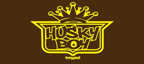
I'll be honest with you. Even though I got my creative juices excited and released last weeks "Husky Boy" design in 2 available colors, I wasn't completely happy with it. A part of me was like "Yea! I finally did it and it looks cool." It just wasn't enough to get me excited to wear it. Originally it was a take on Soulja Boy's logo, but at the end of the day... I wasn't feelin' it and Soulja Boy is just plain wack. Don't get me wrong, it was a clean design but not enough to go final with it.
Husky Boy 2.0: The only thing I liked about the original idea was the shield looking icon that was supposed to be the letter "o." I wanted to make that the main emphasis to the 2nd design. Outkast's original logo came to mind and the thought of "Husky Boy" centered in the middle of their shield plate had me designing the idea this morning. Am I happy? Very. It holds true to the compromise I made for myself, blending Hip-Hop related idea's with Filipino themed designs like the Pek-Pek and Bomba Starr shirts.

No comments:
Post a Comment